
How Professional Squarespace Design & Customisation Transformed This Travel Blog
PLEASE NOTE: As clients have full ownership and control of their site after the project is finished, I don’t link to the live sites as I cannot guarantee they will still accurately represent my design decisions. See more of my Squarespace web design projects in my portfolio.
Is Squarespace good for bloggers?
Squarespace is one of my favourite platforms for bloggers. It's intuitive, beautifully designed and surprisingly powerful, especially if you add a little custom code. But as your blog grows, you may discover that the built-in features aren't enough to create the experience you envision.
That's exactly where this project began… My client Becky had an incredible collection of travel and mountain biking content, but readers were struggling to navigate and engage with it. The design was boring and lacklustre and the built-in Squarespace features just weren’t enough anymore.
By combining thoughtful design to give the website a brand new look with custom features carefully chosen to make it as user friendly as possible, we transformed the site into an awesome resource that's easier to explore, easier to manage and designed to keep visitors reading.
I had a really great experience working with Kayleigh on the redesign of my website and blog. I basically gave her free rein and trusted her with most of the details and she she did an amazing job! Communication was excellent and I'm super happy with the way my site turned out. I'll definitely hire her again as future projects/edits come up. I highly recommend working with Kayleigh if you're looking for a great Squarespace designer!
Custom Squarespace Blog Design
A successful blog isn't just about publishing great content. It's about creating an experience that encourages visitors to stay, explore and come back for more. As part of this project, I completely reimagined the website's visual design, starting with bespoke Home page and About page layouts that better reflected the personality behind the brand. Rather than relying on a standard template, I started with a blank slate and every section was designed to guide visitors naturally through the site, capture their attention and give them a taste of the ‘Life on Two Wheels’ brand.
To give the website a a more cohesive look, I developed a colour palette inspired by the client's own photography, drawing on the warm desert tones, earthy neutrals and rich forest greens that feature throughout her travels. Those colours were carried consistently across buttons, backgrounds, typography, icons and design accents to create a cohesive visual identity that wasn’t too polished or slick. Becky wanted to keep the blog super down-to-earth and approachable
Photography also became a much bigger part of the user experience. Instead of using images just as blog thumbnails, they were used throughout the site to tell the story of each destination, to aid and encourage navigation, break up the long-form content and create a more immersive browsing experience.
Improving the Blog’s Home Page
With hundreds of biking guides and destination articles, the homepage needed to do much more than simply showcase the latest blog posts. I completely redesigned the layout to help visitors quickly understand what the blog offered and discover content that matched their interests. The multiple entry points into the blog from the home page now encourage more engagement and allow everyone to find what they are looking for:
Mini Welcome / Meet Becky: well known in the field, some visitors may come to find out more about here (check out below how we revitalised the About page) while for others, they want to know why they should listen to her
Latest Post: find newest content for regular visitors or those with a time-specific focus, such as the best bike trails this season, latest gear releases, etc
Category Links: Using the built-in categories and tags attached to posts, we were able to create links to pages with posts in a specific category – the image gallery links make them much more appealing and enticing for a visitor to visit and read about something they might not usually… but also make it so easy for those with search intent to find what they are looking for.
Spotlight: Using the summary block with a filter for posts tagged by a specific category (in this case, Utah), we could create a section where Becky can feature posts and easily change it up month by month or season by season. Here she is able to display posts for a certain location, certain topic, certain biking type, etc
Mailing List: A quick spot to take emails for those who would like to hear more about life on two wheels…
A Functional Footer: A footer with more than a copyright! Links provide access to the most popular categories and main pages on the site, along with a little bit of bonus branding in the logo and instagram

Improving the Blog’s About Page
The site only has a few regular non-blog pages, About, Work With Me and Get In Touch. We wanted to make the most of these and to really set them apart from the blog area of the site. The focus here was to communicate Becky’s story and values with brands interested in collaborating. Little touches like the timeline and interactive map (the markers link to posts!) are some of my favourite parts of the site and can easily be updated by Becky herself. The map has great potential as Becky partners with biking destinations and touring companies and could be a perfect addition to any travel blog.
The About page was transformed from a simple biography into a page that takes you on a journey with Becky. Rather than presenting information as a block of text, the content was reorganised into more unusual and visual layouts that tell the story behind the blog, showcases the client's passion for travel and makes it easy for visitors to understand why they should follow her journey or advice.
A timeline of Becky’s backstory makes for a more interesting read than a simple paragraph. Even though the same amount of content was written, just a layout change and a little bit of animation made this section 10x more engaging for a visitor. We also featured a list of Becky’s faves. Inaddition to being a great opportunity for affiliate links for make a little extra $$ this also means she can forward fans to this section whenever her favourite equipment comes up or any commentors or social media followers ask her for recommendations.
Lastly we allowed visitors to be able to see her posts both on a map and in a gallery with a photo for each year (more on the multi-point map below). Aside from making for a good user experience, this again reinforces Becky as an industry expert – it’s easy to see how many years she has been posting for (plus great photos always help!) and how many places she has visited by the points on the map.

Squarespace Customisations for Blogs
Interactive Multi-Point Map on Squarespace
As standard, the Squarespace map features only allowed one pin to be displayed. It is actually linked to Google Maps and you will see a dropdown of suggestions in Google Maps as you type in the desired destination for your pin. If you’re looking for something a little more advanced though, there is an awesome option available. I created a custom map using the Squarespace map block that showed pins for each of Becky’s blog posts. Each blog post can be given location data (this also works with Events Pages) and then each blog displayed as a pin on the map. We made them clickable with a small pop-up stating the name of the linked post and the blog categories/topics if covers.
We explored various layouts with different coloured pins for different topics, custom colours in the map itself (who wants the standard instantly recognisable Google Map?) and different ways and places to display the information of the relevant post when clicked but this is ultimately what we settled on, isn’t it cool?

Custom Sliding Mega Menu on Squarespace
Due to the large number of posts and categories in Becky’s blog, a regular Squarespace navigation bar was unlikely to cut it! It was important to have easy access to her main categories for visitors (she knows some people come just for gear reviews, some are mostly interested in her reviews of trails near their home state, etc) so I built out a custom slide-in mega menu. Aside from being a fun, sleek touch to the site, and making her content super easy to access, the mega menu is another opportunity to showcase her brand with custom icons and brand font. I built out two versions, one for desktop and then a streamlined version for mobile to give the best experience on all devices.

Adding A Blog Sidebar (to Squarespace 7.1)
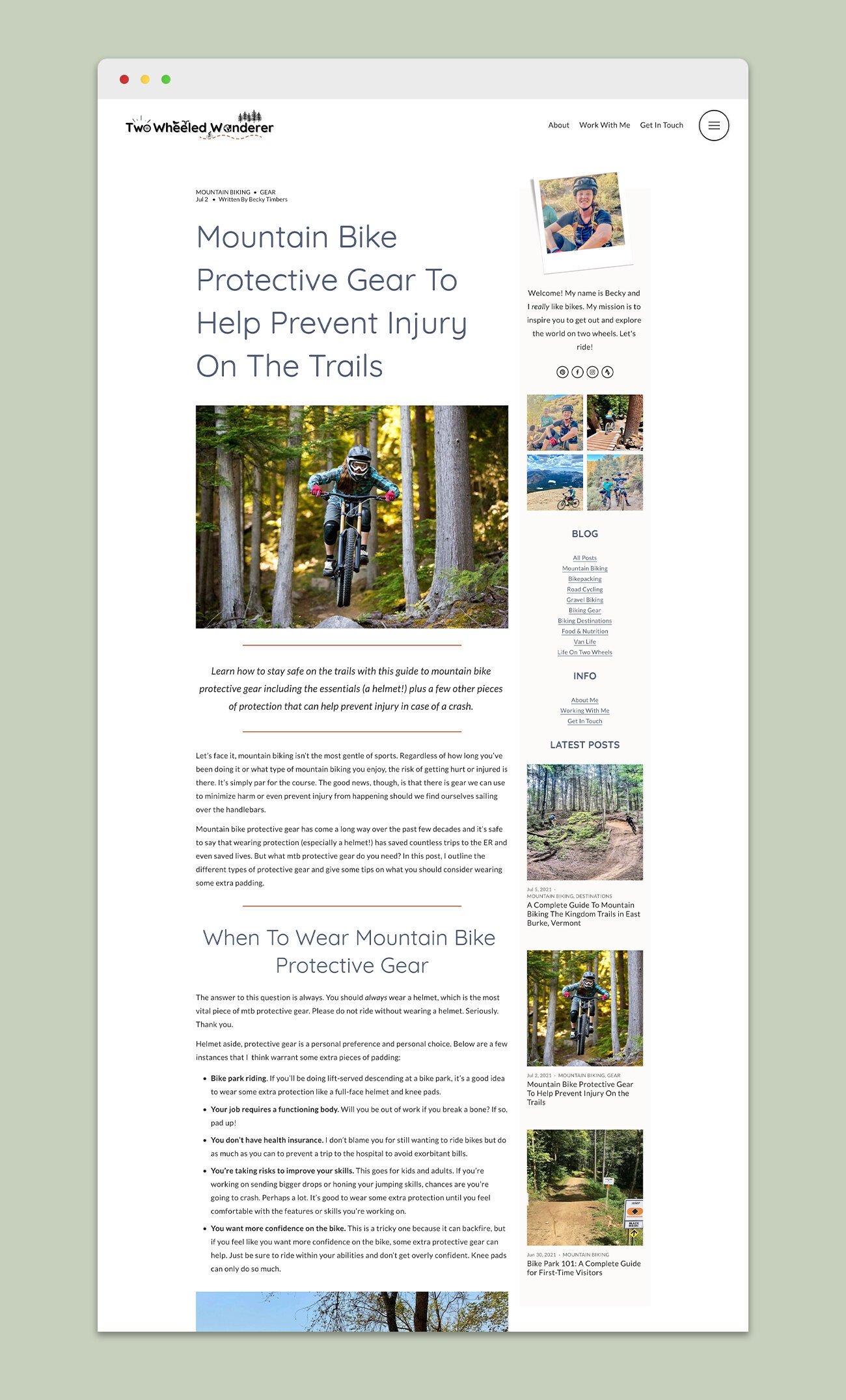
Blog Post Filtering on Squarespace
I transferred over all of Becky’s existing posts, categories and tags. Together we established exactly which categories Becky wanted to move forward with and then which subcategories would go within each of these. Having a planned structure is paramount with such a big blog, both for you and for your visitors.
The blog was split into 6 main categories, and within those visitors could further niche down – or just choose to scroll as the top level (or of course, just view ALL POSTS and really dive in). Below you can see two examples, All Posts and Biking Destinations – which was one of our main categories.
In the All Posts page, a filter on the right allows visitors to filter by Category/Topic and by Keyword. We needed to keep these filters fairly on the All Posts page as she has so much content covering so many different topics. However, in the Biking Destinations category we were able to be more specific, allowing readers to filter by US State - where the vast majority of Becky’s posts are about – or by other countries worldwide.
It’s also possible to create filters like this for Products/Stores, Events, Portfolios, Galleries and more… filter design options are endless, so hire me for a day or half-day if you think your Squarespace website could use an upgrade in functionality.

Lazy Loading …(aka How To Display More Than 30 Blog Posts in a Summary Block)
As you can see toward the bottom of the image above, at the end of the blog posts there is a button ‘Load More (47)’. This is because in this category, Becky had 77 posts but the Squarespace summary block only displays 30 as standard. It’s possible to use a small amount of code to ‘hack’ the block to display up to 250 so we did just that! As users reach the bottom of the first 30 posts, they see a Load More button to display more posts. Displaying all 77 posts right off the bat would have added a bit of extra load time to the page so we decided against that, the extra posts will load 15 at a time when the button is clicked and therefore only need to be loaded when someone actually scrolls far enough for them. Another options was to have them ‘lazy load’ – meaning they load once you scroll down, but Becky liked the interactivity the button provided!
Want to launch a blog on Squarespace?
If you are the type to go big or go home, want multiple rounds of revisions and a white-glove experience, check out my custom Squarespace web design packages.
If you would prefer my expert Squarespace input for just a day or half day, you can do just that.
If you’re looking for a budget-friendly Squarespace website but still want a pro to be involved, a Template Remix might be right for you. I’ll customise a Squarespace template to perfectly fit your business, getting you online with zero hassle in just 2 days.
Lastly, if you’re a determined DIYer, my Premium Squarespace Template Store features gorgeous, strategic Squarespace templates designed by yours truly. I’ve packed everything I’ve learned from 20 years in web design and 8 years specialising in Squarespace into each design, along with access to my Template Hub, video tutorials, Setp-By-Step Launch Course and resource library just for template customers.



Discover how I overhauled this travel blog to maximise visual impact, ensure reader engagement, create excellent usability and grow the owners business and income in just two weeks.